Visualizing Patent Claims and Figures Over Time
How have the number of patent claims and patent figures changed over time?
Let’s let the numbers speak for themselves. I recommend that you use the full screen mode for this visualization. Click on the full screen icon on the right.
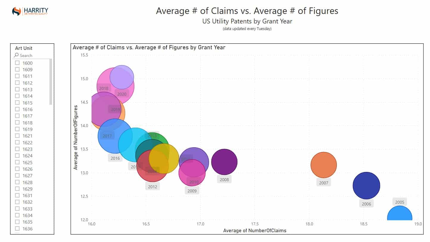
The interactive visualization above provides a clear indication that at a high level for US utility patents, the average number of claims have gone down over time, while the average number of figures have gone up. In 2005, the average number of claims per patent was 18.83, while the average number of figures was 12.04. Compare that to 2019, where the average number of claims per patent was 16.22, and the average number of figures was 14.84.
The reasons for these changes are open to interpretation but the data shows some very interesting outliers to the averages when you slice the data by art unit. For example, when you look at the business method art units of 3621-3629, the data shows the exact opposite from the entire patent field as a whole. In 2006, the average number of claims per patent was 24.83, and the average number of figures was 17.00.
The xml data powering the Power BI visualization above is automatically downloaded weekly by our patent analytics system from the USPTO using the Bulk Data Storage System.
To learn more about how you can use patent analytics to inform your practice, visit our Patent Analytics website HERE.